Posted By Ray Nicolini
Via MobileSyrup.com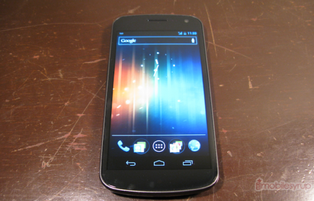
We’ve been using the Galaxy Nexus as our main phone now for a few weeks now, and for the most part it is a great experience. But, as with any relationship, as you spend more time with the person or thing, quirks naturally arise. In the run-up to December 8th, when the device will be widely availablefor $159.99 on a 3-year term from Bell and Virgin, we thought we’d give an updated perspective, so you know what to expect from this most-anticipated device.
Form
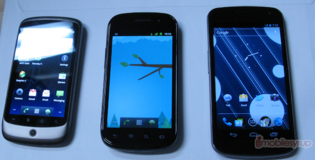
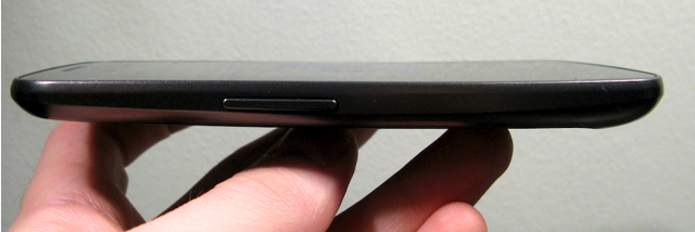
The first thing you have to consider is whether the phone is too big for you. If you’ve played with the Galaxy S II you have a good idea of the size, but we find the Galaxy Nexus more comfortable to hold; that “contoured” backing really does conform quite well to your hand.
Admittedly, there have been times we wish the screen was smaller. More often, Android apps are being designed with an internal “home” button in the top left corner. The official Twitter app, for instance, allows you to touch the top left to change accounts, while the popular FriendCaster Facebook app uses that area to go back to the app’s starting screen. This area is not possible to hit when holding the device in your right hand, period. You must cradle it in your right hand and press with the left. While these commands can often be emulated by going into the context menu and pressing “Accounts” or “Home” respectively, it isn’t as intuitive or comfortable.
Every owner of the Nexus S we’ve shown the Galaxy Nexus to has remarked on its size. For better or worse, this is a big phone and while it is extremely comfortable, part of us wishes they’d kept it at the 4″ sweet spot (which would make it 4.3″ with the software buttons). We still think the Nexus S is one of the most comfortable devices ever released, and the perfect size.
If there is one advantage to having a larger screen, it’s how fantastic everything looks. The screen on the Galaxy Nexus continues to amaze, even after the initial “shine” has worn off. This is honestly the most stunning mobile display we’ve ever seen, period.
Speed & Ease
We’ve done a lot of LTE reviews lately, and going back to the Galaxy Nexus is a clear step down. That being said, it’s not a deal breaker either. The HSPA+ connection is plenty fast for what we need it to do, and it’s noticeably faster than the same network on the iPhone 4S, which supports 14.4Mbps to the GN’s 21Mbps. There are times when we miss the 40+Mbps speeds of the LG Optimus LTE or Galaxy S II LTE, mainly when downloading large files or loading heavy web pages. It’s just unfortunate that we won’t be able to import the Verizon Galaxy Nexus to Canada and use it on our networks here.
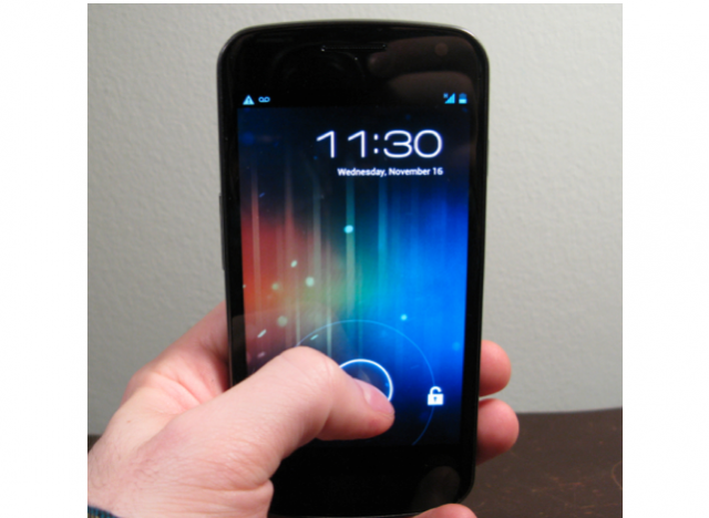
As for the phone UI, we are even more thrilled now than we were in the beginning. The phone is consistently smooth and fast, and constantly delights us with its stability. Little things like being easily able to create folders, or to get to the settings menu from the notification bar, or being able to swipe unwanted notifications away — they’re all small, iterative improvements that we realize in hindsight we couldn’t live without.
The new multitasking menu is not only brilliant but saves so much time. Being able to cycle through your open apps with one touch is by far the best experience we’ve had on any mobile platform. We only wish it were possible, like with the Playbook, to cycle through open applications as we can emails in the Gmail app. Would take multitasking to that next level.
Battery Life
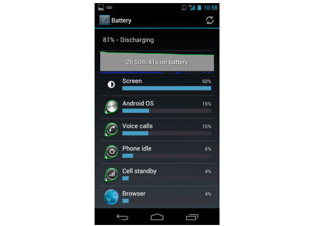
We had loaded the Galaxy Nexus with all our favourite apps, which means more than ever the 1750mAh battery is being taxed with background updates and push notifications, in addition to the regular barrage of emails, phone calls and tweets.
To be honest we’re not entirely satisfied with the battery life situation. It’s quite easy to eat up 50% in a couple hours of furious use. We had hoped that Google would have made background data an opt-in rather than opt-out scenario. At the moment, if you want to prohibit an app from using background data it’s either all or nothing: WiFi-only or unrestricted. There is no ability to granularly set background data based on time of day, location, or limit an app to a specific limit in Megabytes.
If Android wants to win the war on battery life, it needs to impose restrictions to apps the way that iOS does. Yes, we know this is a core tenet of what makes Android “open,” and to some people better, but it will always be at a disadvantage to iOS or WP7 as a result. Would you rather have to explicitly allow an app to use background data, or bring along a spare battery when you leave in the morning? To some extent, these are your options. Third-party apps like Juice Defender have been doing a great job in regulating background updates for years; it’s incumbent on Google to make this more transparent to the end user.
Camera
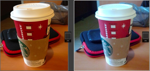
Going back and forth between the iPhone 4S (left) and the Galaxy Nexus (right) really exposes the Android device’s inferiority when it comes to camera quality. It’s great to be able to shoot instantly, but those times you need that function the shots turn out blurry. If you take the time to line up your subject, autofocus and shoot, the advantage over the iPhone shrinks to nothing.
We’re not talking about a night-and-day difference, but there is a noticeable drop-off in detail and colour reproduction, and an unsightly amount of grain when you compare the Galaxy Nexus to the iPhone 4S. Keep in mind, when you look at the photos, that the iPhone 4S shoots at 8MP and the GN at 5MP, so a 100% comparison is not helpful. We have set different zoom levels to compare them at certain stages.
The iPhone 4S is typically warmer, too, with reddish tints and softer whites. It’s better at detecting overexposure in certain scenes and adjusting accordingly. Like the Nexus S, the Galaxy Nexus shoots true and accurate, even if it doesn’t benefit the photo.
Software
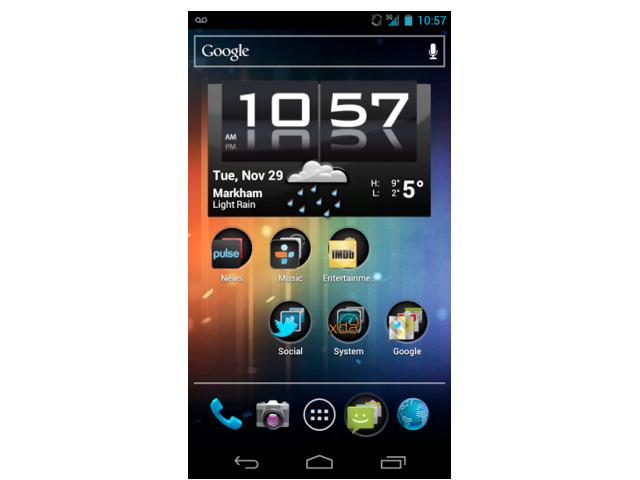
Ice Cream Sandwich has caught up to iOS in so many features, it’s now down to preference. Both have great notification systems, multitasking menus, customization and aesthetics.
Widgets and the home screen paradigm is still a huge advantage for Android — it adds a layer of personalization and intimacy that is not possible on any other mobile platform. Google has improved the experience dramatically in Ice Cream Sandwich, too, making it easier to pick up and use, and far more attractive than any previous version.
Really, it’s now only third-party apps that suffer from the “Android effect.” Equivalent apps on both platforms look and perform worse on Android. Many apps that are available on Android have merely been ported over from iOS, retaining the same design which is often a problem. Android apps need to be customized for different screen sizes, resolutions and usage patterns. Every phone has a back button, and there needs to be uniformity between apps and app developers as to what that back button does; sometimes it returns to the previous screen, but more often than not it just exits.
Ice Cream Sandwich unifies the look of Android phones and tablets, and improves the usability of both. But it’s incumbent on app developers to use the tools given to them by Google to not only make functional apps, but ones that are beautiful and perform consistently. One of the best parts of ICS is that most of the native applications — SMS, Dialler, Browser, etc. — are now good enough to use without resorting to downloading third-party alternatives.
Issues
There are some lingering problems with the Galaxy Nexus. Google has done away with Mass USB storage on non-removable media, so it is not possible to plug and transfer as we could in the past. On our MacBook, plugging the device in allows us to view photos or media, but Aperture does not read the contents properly, meaning there are hundreds of corrupted non-photo files detected. It makes transferring files to and from the device extremely difficult, and while we understand the need for added security, it inhibits one of Android’s most useful features.
Google advertises the Galaxy Nexus as having reinforced glass, and while so far it has been resistant to scratches it is also a fingerprint magnet. To put it bluntly, we have to wipe the the Galaxy Nexus clean every few minutes.
We also want to reiterate from our review that call volume, and external speaker volume, are unacceptably low, and the auto-brightness setting is too sensitive, keeping the screen too dark even in low-light situations. These are things that can likely be rectified with a software update, but they’re annoying.
Wrap-up
A day in the ife of the Galaxy Nexus is a privilege. It’s fast, clean and smart. The OS is the biggest improvement to Android since its inception, and but for a few third-party apps that we’d love to see improved, or ported, from iOS, the experience is just as good.
We love the form factor, the screen and the experience. If it wasn’t for the lower-quality camera, battery life and occasional software bug, we’d call it the best device on the market. In its current form it is the best Android device to date, and depending on your priorities, the best on the market.


No comments:
Post a Comment