By Ray Nicolini
via Mobilesyrup.com
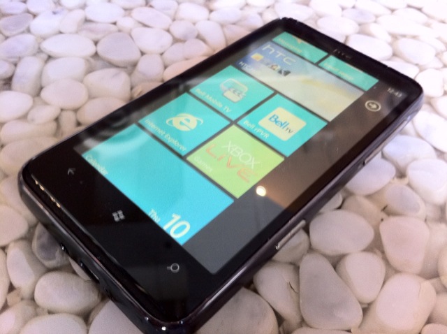
This is the first part of an ongoing series delving into which smartphone OS is for you? Already an iPhone user? Obsessed with your BlackBerry? Need your Android fix? Read on for a taste of them all, and maybe you’ll learn whether…
Is WP7 Right For Me?
A Brief History
Windows Phone 7 was released in late 2010 after much anticipation. A stark re-imagining of the mobile operating system, and a departure from the Windows Mobile that had become obsolete since the emergence of capacitive touchscreen mobile OS’s like iOS and Android, WP7 is all about simplicity. Microsoft realized that they needed to be a player in the burgeoning, and highly profitable, smartphone market, and forged relationships with many of the vendors that created great Windows Mobile devices, including HTC, LG, and Samsung, though HTC is probably the most successful manufacturer to augment and make successful the Windows Phone platform.
Windows Phone 7 was released in late 2010 after much anticipation. A stark re-imagining of the mobile operating system, and a departure from the Windows Mobile that had become obsolete since the emergence of capacitive touchscreen mobile OS’s like iOS and Android, WP7 is all about simplicity. Microsoft realized that they needed to be a player in the burgeoning, and highly profitable, smartphone market, and forged relationships with many of the vendors that created great Windows Mobile devices, including HTC, LG, and Samsung, though HTC is probably the most successful manufacturer to augment and make successful the Windows Phone platform.
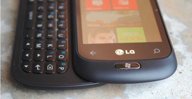
Now, unlike Windows Mobile, manufacturers don’t have a lot of leeway when it comes to producing WP7 phones. All devices must have some seriously high-end specs to meet Microsoft’s vendor criteria, and that includes a dedicated camera button and the same three hardware buttons: Back, Windows, Search.
The minimum specs are:
- 1Ghz Snapdragon processor with dedicated GPU
- 512MB RAM
- 5MP camera with flash and dedicated camera button
- 720p video capture
- 480×800 pixel LCD screen, multitouch compatible
- 1Ghz Snapdragon processor with dedicated GPU
- 512MB RAM
- 5MP camera with flash and dedicated camera button
- 720p video capture
- 480×800 pixel LCD screen, multitouch compatible
What is WP7?
Windows Phone 7 is a smartphone operating system. That much be addressed right away. It is meant to compete with Apple’s iOS, Google’s Android, HP’s webOS. But, does it? At least in its current 1.0 form? In most ways, no. In some ways, yes, and in a few key aspects surpasses them all.
Windows Phone 7 is a smartphone operating system. That much be addressed right away. It is meant to compete with Apple’s iOS, Google’s Android, HP’s webOS. But, does it? At least in its current 1.0 form? In most ways, no. In some ways, yes, and in a few key aspects surpasses them all.
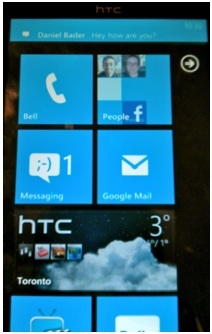
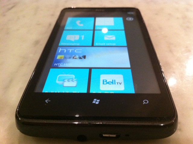
Initially, once you’ve swiped up on a very minimal, attractive unlock screen, you’re greeted with a number of square tiles. Seemingly alive, these tiles are able to display myriad types of information, from the current weather conditions to a reminder note to rotating pictures of your contacts. The more developers that take advantage of the Live Tile system, the more “alive” your home screen will be.
At this point, however, there are few developers taking advantage of this feature. Tiles are conduits to apps, either native or downloaded from the growing Marketplace. To swipe to the right from this screen reveals your vertical list of installed applications. Swiping is your key ingredient to enjoying WP7, and you’ll either appreciate its smooth simplicity, or curse it for the same. For me, it strikes a nice balance between the static, almost cold nature of the iPhone home screen (though it’s without the mature customization potential of folders) and the DIY widget-focused nature of Android.
The operating system, for the most part, performs beautifully. Screens scroll horizontally and vertically without a hint of lag; this should be consistent on all currently-released WP7 phones, since all share the same processor in the Qualcomm 1Ghz Snapdragon. Pressing on an app gives you a nice card-dealing animation, too. Displaying flat white or black text on a contrasting background, the majority of interaction is done by either swiping horizontally against a list of items. The Metro UI is consistently attractive.
App performance is hit and miss. Native ones like the Messaging and Mail applications start up and scroll effortlessly, like they’re hardly breaking a sweat. Twitter clients like Seesmic, or the native Facebook app, stutter and sometimes don’t respond to touch inputs for seconds at a time while you wait for some unknown frozen process to complete. The effect is to frustrate and often bewilder.
The operating system was designed, like the first three generations of iOS, to run only one application at a time. This means that when you’re listening to Slacker Radio, for instance, and receive a toast notification for a SMS (more of that in a second), switching to the message will end the process and the music. Microsoft understands it is late enough to the game to essentially write it off completely, but even minimal support for third-party multitasking would have been a huge selling feature at launch. We know that it’s possible for things to run in the background, as the Zune music player can play while you’re in third-party applications, and email/Facebook can be synced, so let’s hold out hope for 2.0.
.
.
As mentioned, toast notifications are Microsoft’s compromise between iOS’ invasive and rather crude pop-up and Android’s utilitarian sliding bar. Upon being triggered the message appears for several seconds at the top of the screen. Touching it will activate the application that the toast is from. Once finished, you can press the “back” button to return to the app you were in, usually in the same state you left it. This is about as “multi” as your tasking will get in WP7, and turn-around is pretty quick, but it doesn’t hold a candle to Android or even iOS4.
Apps also take a while to load, and when you leave one to, say, answer an email or SMS, they often take up to ten seconds to resume. If you’re a patient person, the process itself is simple and effective enough to overcome the frustration of waiting. Worse, however, is when you lock the phone, only to have to spend ten second “resuming” before you’re back where you were. Microsoft needs to implement a save state mechanism to prevent this from happening.
At this point, though, there is an impending update slated for mid-to-late March, 2011, that is supposed to be bringing copy-paste support to the WP7 platform, as well as much faster app launching and resuming. We will report on the improvements when it becomes available.
Native Apps
No one does Exchange better than Microsoft, and its implementation really shines here. Adding and synchronizing with an email account is as simple as entering your Google, Yahoo, Live or Exchange credentials and watching the magic happen. I use Google for my email, calendar and contacts, and once synchronized, your contacts are accessible throughout the OS. Further, there is native deep Facebook integration, allowing you to associated existing contacts with your Facebook friends and their pictures, phone numbers and personal info.
No one does Exchange better than Microsoft, and its implementation really shines here. Adding and synchronizing with an email account is as simple as entering your Google, Yahoo, Live or Exchange credentials and watching the magic happen. I use Google for my email, calendar and contacts, and once synchronized, your contacts are accessible throughout the OS. Further, there is native deep Facebook integration, allowing you to associated existing contacts with your Facebook friends and their pictures, phone numbers and personal info.
The People tile sits next to the Phone tile and its power really is a testament to restrained simplicity. All contacts are accessible via an alphabetical grid, or by search. From there you can call, text, email, or write on their Facebook Wall. Facebook updates, once configured, are available in the What’s New portion of the People screen. Swiping to the right again, below the monolithic title word (all titles are displayed in large text on the top of every screen and are slightly cut off to allow for the effect of movement) finds the Recent tab, where all your latest personal updates are displayed.
The native email app is similarly robust. With an excellent virtual keyboard that rivals any currently on themarket, touch-typing is accurate and satisfying. Email is generally customizable, though the lack of support for Gmail labels and conversation view is disappointing. Mail can be sorted into Unread/Flagged/Urgent and IMAP/Exchange folder hierarchy is honoured. WP7 also supports push for services that have it, such as Gmail and Hotmail.
The calendar integrates well with Exchange/Gmail and supports Day/Week/Month or Agenda view. Updates made on the device are synced, too, with the web. The lock screen and live tile are updated to show the upcoming appointment, a very helpful inclusion.
The Zune media player will be familiar to anyone who has used the popular device. I’d argue that the Zune Desktop software is much more attractive than iTunes, though in Canada we are limited to local music and podcast transfer – purchasing/Zune Passport support is not available. What is available is offered in an intuitive package that recognizes your phone independent from any other WP7 phone.
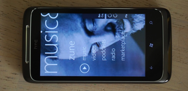
Once on the device, music can be played in the background while surfing the web or when in your favourite app, and the quality of the HD7 is excellent, both with and without headphones. The device supports MP3/WAV/WMA/eAAC+ for audio and MP4/WMV/H.264/H.263 for video. Your DivX/custom MKV files likely won’t play, but we’ll see whether Microsoft allows for third-party apps to support these codecs in the future.
The audio and video experience is fantastic on WP7, especially on a large screen device such as the HD7 or Venue Pro. Album art is prominently displayed, and navigation is intuitive and smooth. If you wish to pause the song when out of the app, controls are available when swiping the top of your screen, revealing your connectivity and battery information as well as, when playing, the ability to pause and skip songs. Very cool.
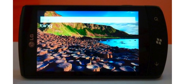
Bing Search is integrated into the OS, and is one of the more complete features available. At any time you can press the hardware search button and it will take you to a basic Bing text input. As with the desktop, Microsoft provides a new, interesting background picture along with its austere text input, and it works even better on a mobile device. Search includes both local and web-based content, you can search your friend’s number or the local pizza shop.
Holding down the Windows button for a few seconds will result in a voice input prompt. As with search, this can be used to, say, “Call Jenny, mobile,” or “Search pizza, Toronto.” The recognition is fairly accurate. Coupled with the excellent and reliable Bluetooth connectivity, and it’s the best way to call home in the car or search on the go. Kudos.
Bing Maps also gracefully took the Silverlight plunge into mobile, and though turn-by-turn navigation is not yet available, the text-based directions are accurate, and performance is silky smooth.
Heading to the browser, WP7 uses an optimized version of Internet Explorer 7. What this means is that browsing is fast and desktop pages are rendered accurately. Pinch-to-zoom is buttery smooth. Six tabs are available at any time, though they are accessible via a button on the bottom right of the app, and are more windows than tabs. Turning the phone to landscape mode will eliminate any controls and allow for a great full-screen browsing experience, though there is no way to get to the address bar when in landscape mode.
The browser is fast, but it’s also based on dated code, and supports no HTML5. That means that most mobile pages designed for WebKit devices like iPhone or Android will not display correctly. You’ll be waiting longer for the desktop version to render, but when it does, text usually re-aligns perfectly and will adjust when zooming in and out.
Text on WP7, and especially in the browser, is gorgeous. Microsoft is using these high resolution screens to their fullest potential, and I’ve found the fonts to be eminently readable. The same text on the same resolution screen on WP7 and Android appears sharper and more readable on the former. Kudos.
Third-Party Apps
The Windows Phone Marketplace is growing at a quick clip, and the number of quality apps is increasing, too. Namestays like Facebook, Twitter, Netflix, Seesmic, Foursquare, are all there, and have been since its October launch. Independent developers, too, are taking advantage of their Windows Visual Studio and Silverlight experience to get their hands dirty. Microsoft boasts there are over a hundred thousands registered WP7 developers, and with 9000 apps in six months, the Marketplace is growing faster than any app store in history. Some of the best apps I’ve download so far, like Wonder Reader, an RSS app, and OMG, a fun space shooter, have been created by individuals but due to the robust development tools, stink of a professional studio.
The Windows Phone Marketplace is growing at a quick clip, and the number of quality apps is increasing, too. Namestays like Facebook, Twitter, Netflix, Seesmic, Foursquare, are all there, and have been since its October launch. Independent developers, too, are taking advantage of their Windows Visual Studio and Silverlight experience to get their hands dirty. Microsoft boasts there are over a hundred thousands registered WP7 developers, and with 9000 apps in six months, the Marketplace is growing faster than any app store in history. Some of the best apps I’ve download so far, like Wonder Reader, an RSS app, and OMG, a fun space shooter, have been created by individuals but due to the robust development tools, stink of a professional studio.
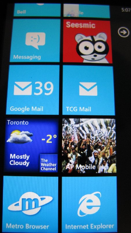
Not all is roses in the Marketplace, however. Microsoft has received a lot of heat for holding up app updates for arbitrary reasons, sometimes forcing the developer to re-release it with a different name to get around the unexplained delays.
App prices, too, are extremely high. Tetris, a $2.99 game in the Apple App Store is an extravagant $5.49 in the Canadian WP7 Marketplace, and prices seem to be similarly exorbitant for apps, too. This occurred with the Android Market in its beginning, but almost six months later, WP7 apps still seem extremely overpriced.
One of the nicest features about the app ecosystem on WP7 is the ability to try before you buy. Developers can set feature- or time-limits to apps, or include ads in the free version which will disappear once purchased, without forcing the user to download a Lite version. This is a definite stepping stone to devs making more money from their apps, as buying a trial app becomes merely a one-click process.
.
.
Is WP7 for You?
I have inundated you with a lot of information about the Windows Phone world, and I wouldn’t have done that unless I truly believed in its potential. Currently limited in many ways, Windows Phone should be receiving two important updates in 2011.
I have inundated you with a lot of information about the Windows Phone world, and I wouldn’t have done that unless I truly believed in its potential. Currently limited in many ways, Windows Phone should be receiving two important updates in 2011.
The first is coming within a month, and will include basic copy-paste functionality, as well as faster loading times for apps. That ticks off two initial problems I have with the ecosystem.
Further down the line an update should bring further performance improvements, multitasking, as well as updating the browser to support HTML5 and other modern coding standards. Microsoft has assured users that the updates will not be carrier-dependant, avoiding the often-crippling problem of providers needing to update, and therefore tweak, Android updates, delaying them for months.
Since the broad partnership with Nokia that was announced earlier last month, a couple things have become clear. Microsoft and WP7 is not going anywhere. They are pumping millions of dollars into advertising and are paying developers to create apps to fill the Marketplace with quality. Nokia, the world’s (current) largest handset maker, seems to have enough confidence in Microsoft’s ability to compete (or are without tenable alternatives) that they are going to be putting WP7 on every high-end smartphone by the end of next year. What that means for HTC and Microsoft’s other partners is unknown.
The advertising would make you believe that WP7 is for people who want to use their smartphone as little as possible, since all pertinent information is right there at your fingertips. I find this to be disingenuous, as Android is far better suited to this as it supports widgets.
Currently, WP7 is for people who yearn for the smooth simplicity of the iOS ecosystem without the Apple narrative. It’s for those who want diversity in their handset choice and for business users who want extensive Exchange integration. It’s for gamers, since the XBox Live integration is fantastic. It’s for the young texter who needs a quality virtual keyboard with an intelligent notification system and gorgeous UI. It’s for the Facebook lover who wants all their friends’ info integrated right into the OS.
WP7 does a lot of things well, and will continue to improve. In its current form it has no shot of competing with Android or iOS in terms of volume, but at the very least, every person I’ve shown a WP7 phone says two things: it’s incredibly smooth and it’s incredibly sexy. I’ll add that it’s fast, too.
Whether these things will be enough to convert you from your current smartphone OS of choice remains to be seen, but you certainly can’t knock Microsoft for trying.
No comments:
Post a Comment